Monthly Archives: September 2012
9-11-12
7-20-12
7-14-12
12-1-08
7-20-12
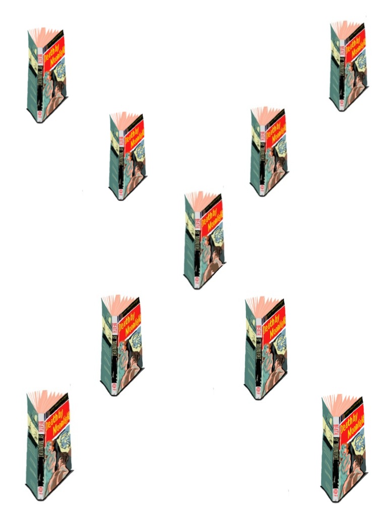
Introduction to geometry. At least in my digital composition of a book repeated several times to make an implied X shape. I haven’t read this one. It’s cover and text are printed on cheap stock that’s probably not acid-free which accounts for the pages turning dry to the touch and brown-like in color. I’m afraid to open it up for a read because the binding is shot and pieces seem to flake off in my fingers. Despite this, no harm came to this kitschy cover while drawing it. (Unknown illustrator)
8-29-12
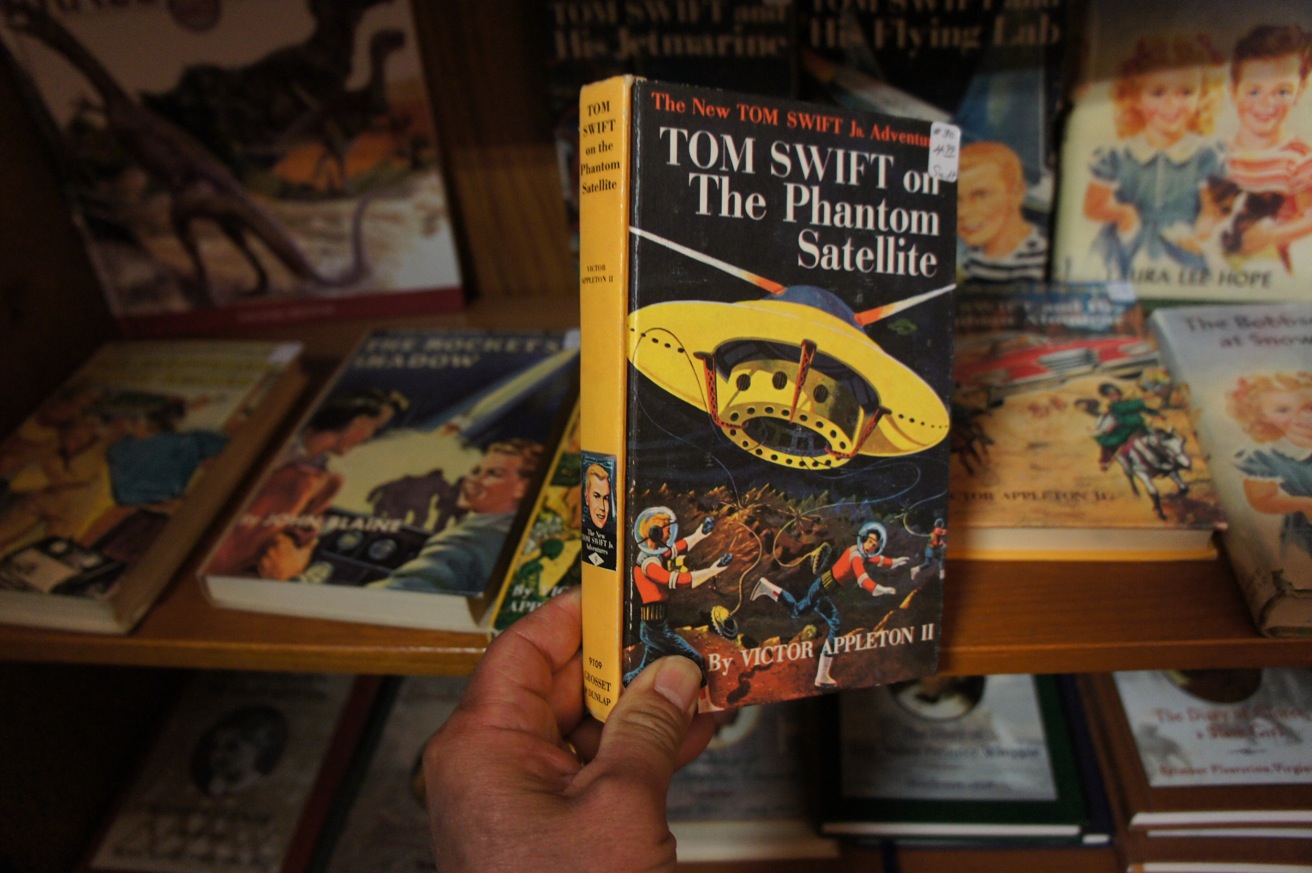
Scouting out the Inland Empire. Killing time in an antique store in Riverside, CA, I found a gem from my childhood. Reading is a good thing and I got hooked early on from books like this. The Tom Swift series was an action-based series of books geared to guys. I liked the covers maybe as much as I liked the stories. These books were the start of my fascination with illustrations, the impact of a single image, and skillful rendering. (Illustrator, Graham Kaye)
8-21-12
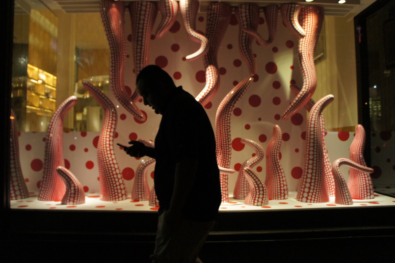
Connecting the dots. The queen of polka dots is the Japanese artist Yayoi Kusama. This was a window display near Union Square in SF and it coincided with her exhibition at a museum in NYC. It’s remarkable how much territory a person can cover with such a focused graphic theme like dots. Her work has invention and obsession and continues to be fresh. While older in age, she is a living example that artists do not retire and go away. (Window designer unknown)
8-21-12
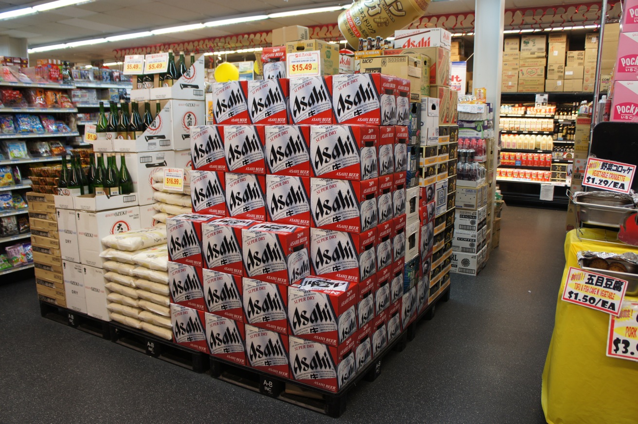
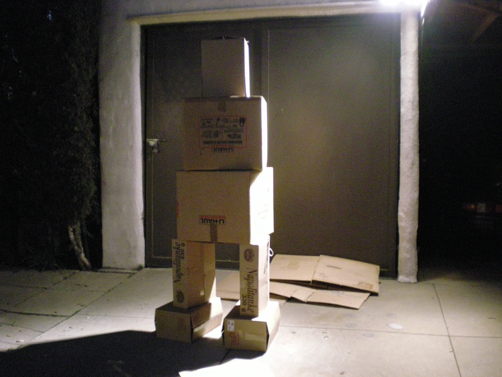
P.O.P. not pop. Point-of-Purchase is an advertising term. It applies to the advertising and displaying of consumer items in a retailing setting like the stacks of these Asahi boxes and especially the inflatable floating can above it. I came across this at a grocery store in Little Tokyo, Los Angeles. The display caught my eye because of its geometry, pattern, and sculptural quality. For the time being on my site’s opening page, I have a painted figure made up of repeating cube-like shapes inspired by P.O.P. (Retail installer unknown)

