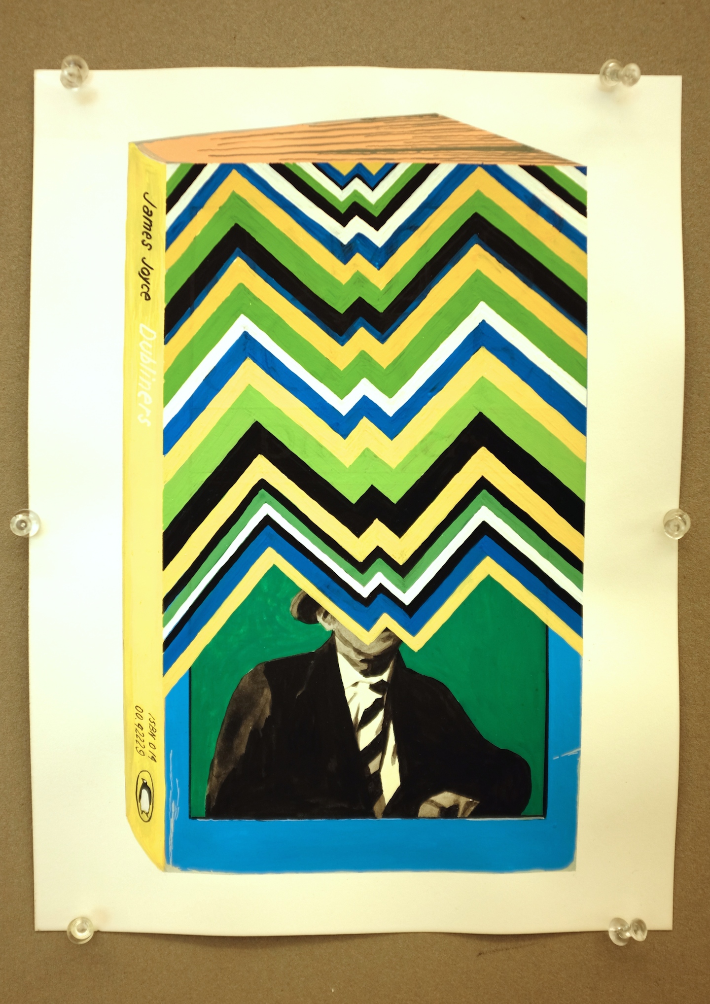
2:30 PM. Color and stripes. Someone asked me about colors and how I arrive at certain color schemes. In this case, the original book cover had an overall cool palette with the blue border and blue green background behind the author’s portrait. It was natural to take variations of the original hues and trust that it would work out. More importantly was how far should I go in overtaking the original design and still making the end result readable. That’s why the angle of the stripes had to mimic the tilt of the face and frame Joyce’s mouth creating a subtle emphasis.
